In the fast-paced world of e-commerce, the difference between a visitor and a customer often comes down to one thing: design. At Sprite Genix, we understand that not every entrepreneur is a coding wizard. However, a "boring" website can be transformed into a professional, high-converting powerhouse in just 10 to 15 minutes using the right methods.
Drawing from recent insights on utilizing the Shopify platform for 2026 and beyond, this guide explores a proven method to customize themes, optimize landing pages, and boost sales potentially by 2x without writing a single line of code.
1. The Foundation: Smart Setup and Theme Selection
Before diving into pixels and padding, the foundation must be solid. A strategic approach to Shopify involves leveraging extended trials to keep overhead low while you design. By searching for specific partner offers (like "Page Fly 3 month trial"), you can secure a 3-month trial for just $1, giving you ample runway to perfect your store before launching.
Once logged in, the choice of theme dictates your store's structural potential. While many rush to buy expensive themes, free themes like "Horizon" offer immense flexibility if you know how to customize them. The key is to understand the hierarchy of Shopify’s editor:
• Header: The top navigation and logo.
• Template: The dynamic middle section where banners and products live.
• Footer: The bottom informational section.
Changes made to the Template affect the specific page you are on, while Header and Footer changes apply globally.
2. Crafting the Visual Hierarchy
A common mistake in DIY web design is a cluttered interface. To achieve a premium look, you must refine the layout.
Header and Navigation For a balanced, branded aesthetic, move your logo to the center rather than the default left. This creates a symmetrical look that works beautifully on desktop, flanking the logo with your navigation menu. When setting up your main menu, don't just use generic labels. Create specific collections (e.g., "Six Pocket Cargo," "Electronics") and link them directly to the navigation bar to reduce the number of clicks a user needs to find products.
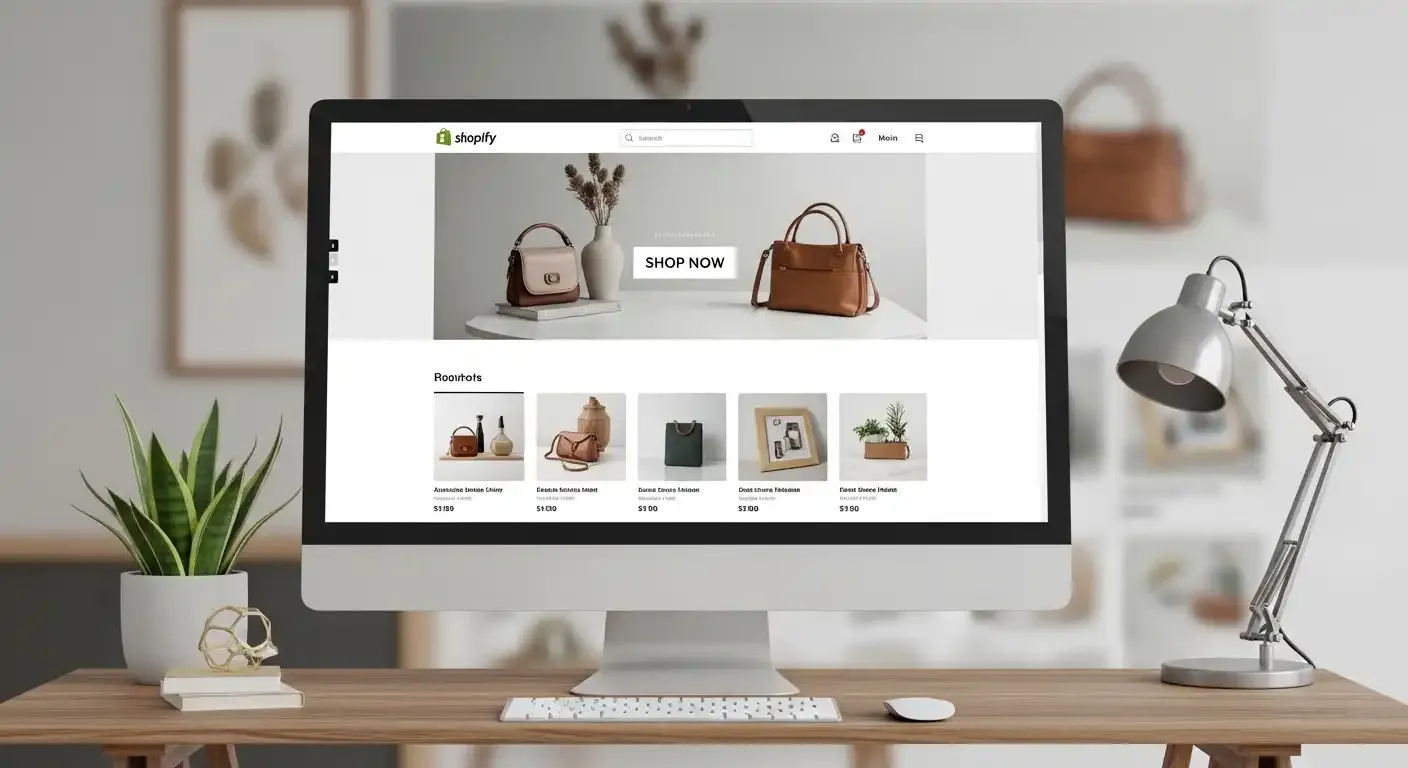
Hero Sections and Banners The "Hero" or "Slideshow" section is your digital storefront window. High-quality graphic design is non-negotiable here. Use tools to create banners beforehand, then upload them to a Slideshow section.
• Pro Tip: If your banner images are getting cut off or look short, adjust the section size to "Large" in the theme settings to ensure the full image (including the model's feet) is visible.
• Efficiency Hack: Once you perfect the padding and text settings for one slide, use the "Duplicate" feature. This ensures consistency across all your slides without having to manually adjust settings for every new image.
3. The "Secret" to High-Converting Product Grids
Visual flow is critical. A standard layout might stack elements in a way that pushes products too far down the page. To fix this, you can drag and drop sections within the editor. Moving the Product Grid directly underneath your main banner ensures that users see buyable items immediately after being inspired by your hero image.
Mobile Optimization Most traffic is mobile. On a standard mobile view, products might appear as a single column, which requires excessive scrolling. To mimic top-tier fashion apps, adjust your mobile layout settings to display 2 columns. This allows customers to see multiple products simultaneously, increasing the likelihood of a click.
To further professionalize this section, remove generic titles like "Home Page" and rename them to psychological triggers like "Best Sellers" or "New Arrivals".
4. Landing Page Optimization: The Conversion Engine
The homepage gets them interested, but the landing page (product page) gets them to buy. This is where you can implement "100K design secrets" to differentiate your brand.
Visual Storytelling Instead of a static list of images that takes up vertical space, switch your product gallery to a Carousel or Slider format. This allows users on mobile to swipe through images—a natural gesture for smartphone users.
• Aspect Ratio: Ensure uniformity. Set your image aspect ratio to "Square" or "Portrait" so all product photos align perfectly, regardless of their original dimensions.
Section Injection Here is a game-changing tactic: You are not limited to the default product description text. You can inject rich media sections between product details.
• Marquees: Add a scrolling text bar (marquee) above the product information highlighting offers like "50% OFF" or "Free Shipping".
• In-Page Slideshows: Insert a slideshow within the product description area. Use this to display technical specs, size charts, or lifestyle shots visually rather than forcing the customer to read long paragraphs.
By visually breaking up the text with high-quality imagery and sliders, you keep the user engaged and reduce bounce rates.
5. Building Trust and Urgency
A pretty site that looks unsafe won't generate sales. To combat this, utilize "Icon with Text" sections. Place these near the footer or product grids to highlight guarantees like "Delivery on Time" or "14-Day Refund Policy".
Furthermore, avoid using "cracked" or pirated premium themes. Shopify's recent updates can detect these, leading to licensing warnings on your live site which kills customer trust immediately. Sticking to a highly customized free theme is safer and more sustainable.
Finally, enhance functionality with apps. Adding a WhatsApp button for support or a countdown timer for urgency can be done via third-party apps, integrating seamlessly into your newly designed layout.
Conclusion
You do not need an expensive developer to build a brand that looks like a million dollars. By leveraging free themes like Horizon, understanding the "Header-Template-Footer" logic, and aggressively optimizing your mobile layout and product pages with visual sliders, you can build a high-converting store. The secret lies not in the code, but in the creative application of the tools Shopify already provides.
Frequently Asked Questions (FAQ)
Q1: Do I need coding skills to customize a professional Shopify store?
A: No, coding is not required. You can customize themes, layouts, and landing pages using the built-in drag-and-drop editor and settings within the Shopify dashboard.
Q2: Which free theme is recommended for this customization method?
A: The "Horizon" theme is recommended as a flexible free option that allows for the extensive customization and layout adjustments described in this guide.
Q3: How do I stop my banner images from being cut off on the homepage?
A: In the slideshow or hero section settings, change the size option from "Medium" (or default) to "Large." This ensures the container height accommodates the full image.
Q4: Can I use cracked or pirated premium themes to save money?
A: It is highly discouraged. Shopify updates can now detect unlicensed themes, causing license issue warnings to appear on your store, which negatively impacts your brand's credibility.
Q5: How can I display more products on the mobile view of my collection?
A: Inside the product grid or collection settings, look for the "Mobile Layout" or "Columns" option and set it to 2. This displays two products side-by-side instead of one large image.
Category: Web Design Best Practices